Analysis Charts

These visualizations are generated from the notebook and Python analysis pipeline. Each chart below explains what it shows and why it matters.

The dataset time field is minute-second formatted, so hour-based charts have limited spread. To improve time insight quality, this project adds a 5-minute bucket fallback analysis.
100,000 Orders 29.54 min Avg Duration 3.24 Avg Rating

Delay Pattern

Late-order share is high enough to justify proactive intervention workflows.

Experience Pattern

Rating vs duration relationship is very weak in this sample, indicating other factors matter.

Refund Pattern

Refund behavior should be monitored alongside feedback quality, not just delay threshold.

Delivery Duration Distribution

Delivery Duration Distribution

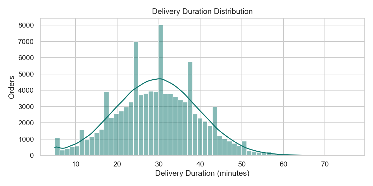
Shows the spread of delivery times and helps identify typical delivery windows and tail delays.

  • Operational use: pick SLA threshold candidates using the dense center and long-tail behavior.
  • Business use: design escalation triggers for the longest-delay segment.
Rating Distribution

Rating Distribution

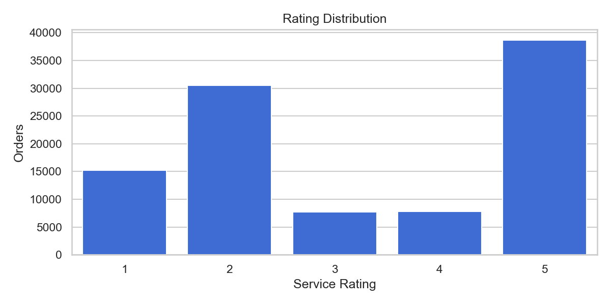
Shows how customer ratings are distributed across all orders and where satisfaction is concentrated.

  • Operational use: quantify low-rating load requiring service recovery.
  • Business use: benchmark customer experience trend across future runs.
Delivery Duration vs Rating

Delivery Duration vs Rating

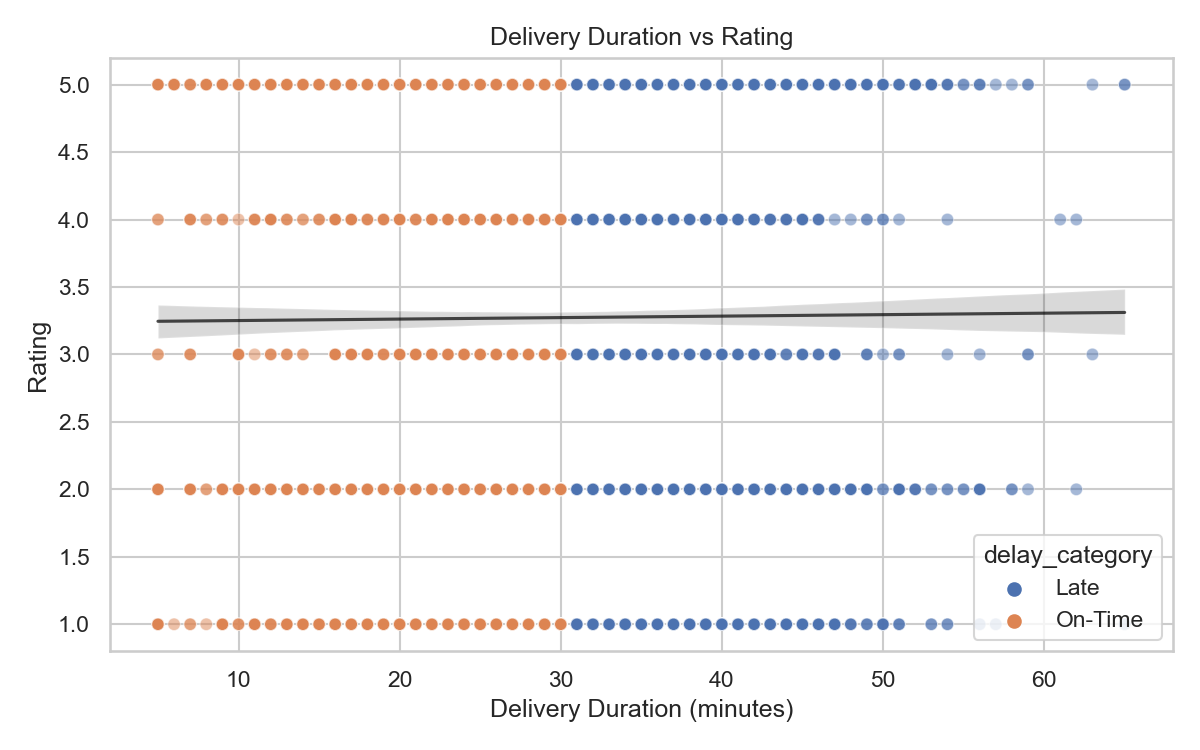
Compares delivery duration and rating per order to check whether slower deliveries reduce ratings.

  • Current finding: weak association in this data, so delays alone do not explain rating behavior.
  • Next step: include product quality, missing items, and support response features.
Delay Category vs Rating

Delay Category vs Rating

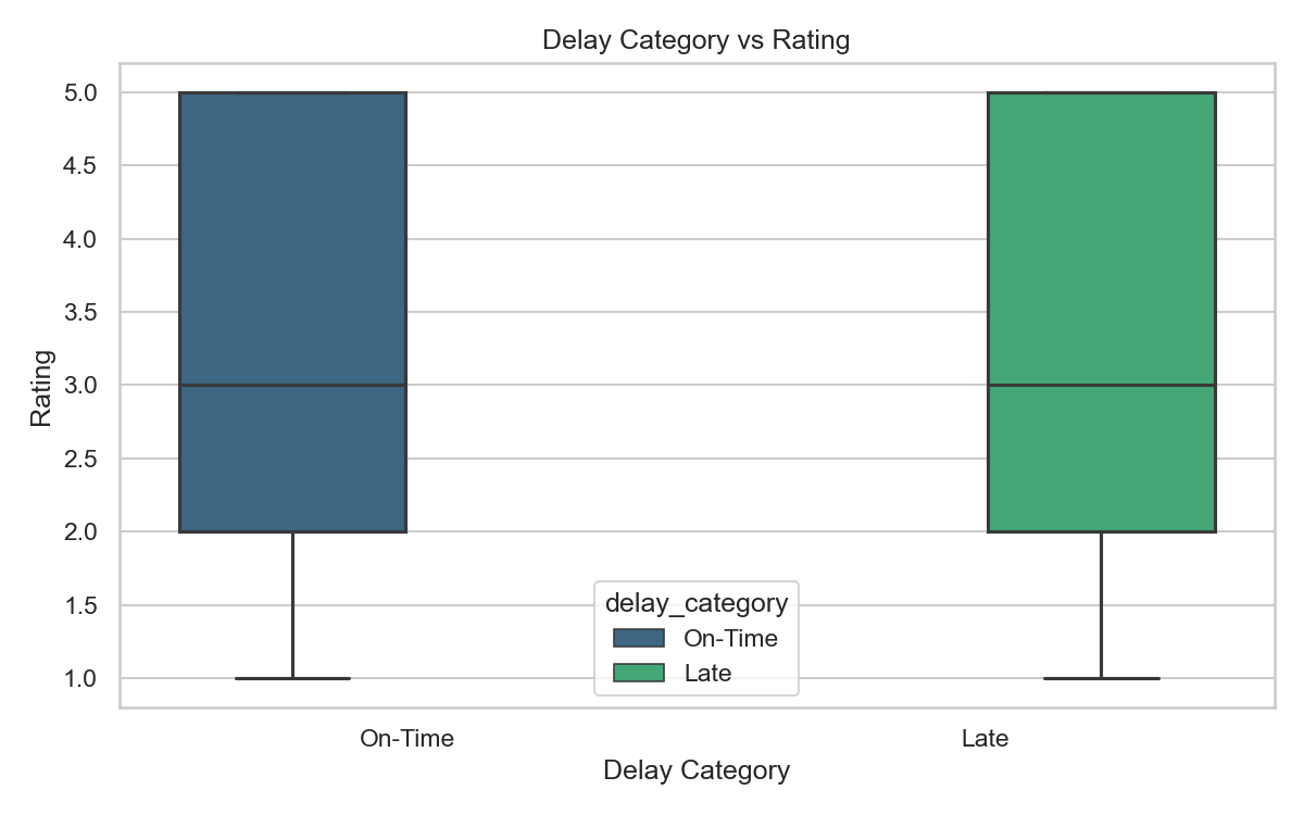
Compares rating ranges for on-time and late orders to highlight variation and median behavior.

  • Operational use: detect whether late orders materially shift rating distribution.
  • Business use: justify compensations for specific delay bands if rating drop is strong.
Orders per Hour

Orders per Hour

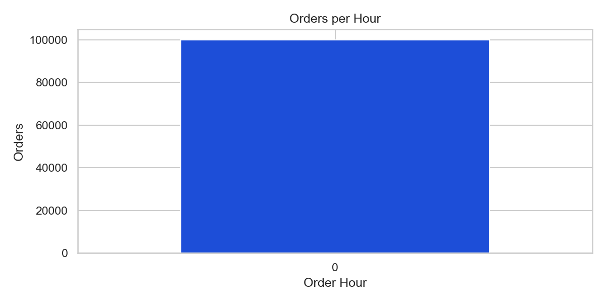
Shows order volume by hour. In this dataset, hour values collapse due to minute-second time format.

  • Interpretation caution: this chart is structurally limited by source time format.
  • Fallback below provides better short-interval time behavior.
Average Delay per Hour

Average Delay per Hour

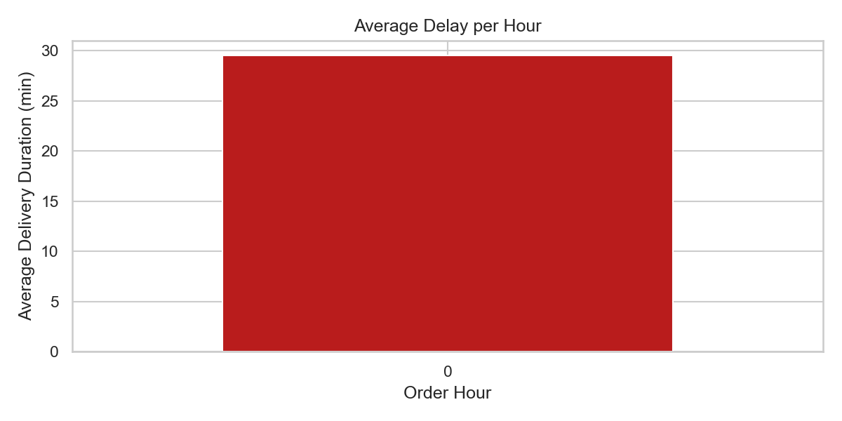
Shows average delay by hour. Useful for finding peak-delay periods when true hour data is available.

  • Operational use: schedule staffing changes around high-delay windows when proper hour data exists.
  • Current project compensates with minute-bucket views.
Orders per 5-Minute Bucket

Orders per 5-Minute Bucket

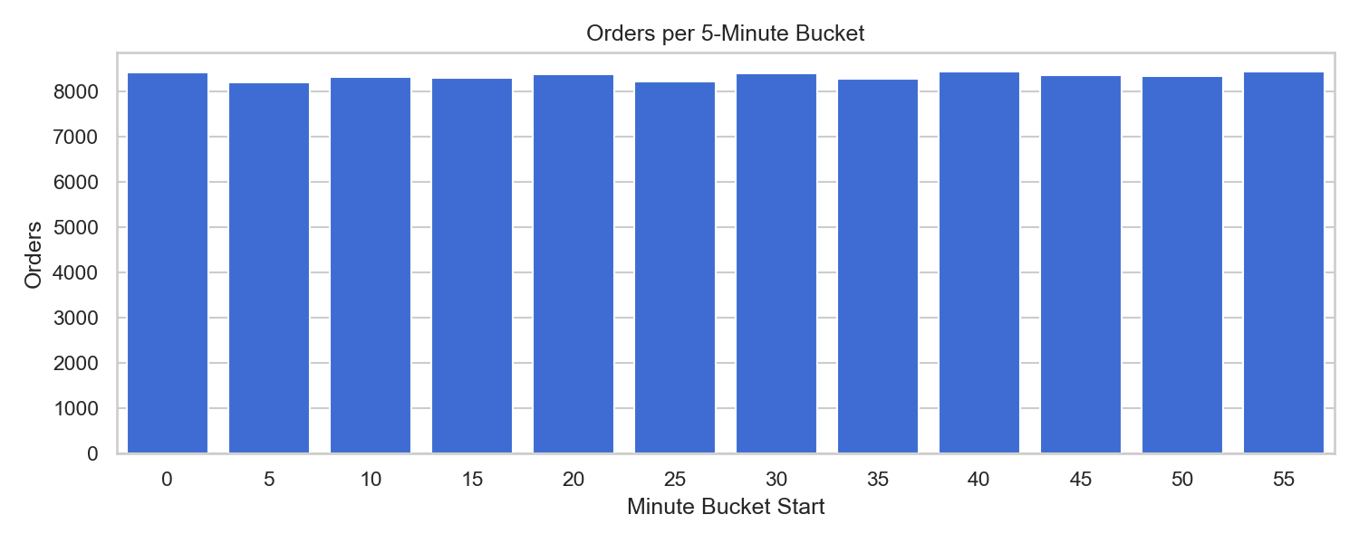
Fallback time analysis using 5-minute buckets when hour-level information is not meaningful.

  • Operational use: understand micro-peaks in order flow even without full timestamp context.
  • Useful for short-cycle dispatch planning and partner queue balancing.
Average Delay per 5-Minute Bucket

Average Delay per 5-Minute Bucket

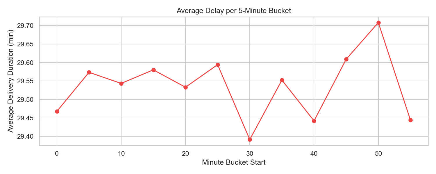
Shows delay fluctuations across minute buckets and highlights the bucket with highest average delay.

  • Current finding: peak delay appears around the 50-54 minute bucket.
  • Operational use: trigger proactive messaging during identified high-delay intervals.
Category Average Delay

Category Average Delay

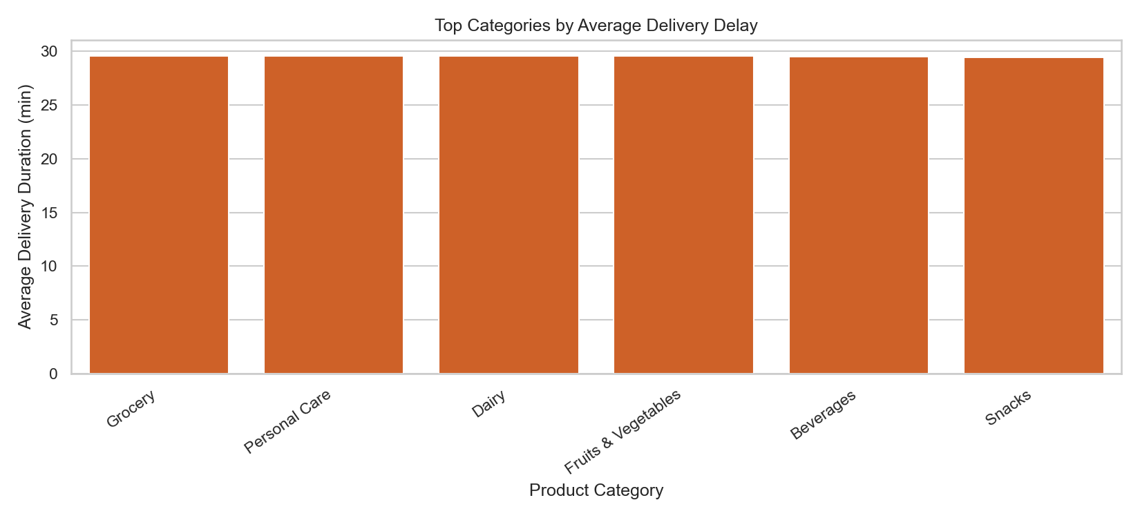
Compares average delay across product categories to identify the most operationally challenging segments.

  • Current finding: Grocery is the highest-delay category in this run.
  • Operational use: tune packaging, picker allocation, and partner assignment by category.
Category Average Rating

Category Average Rating

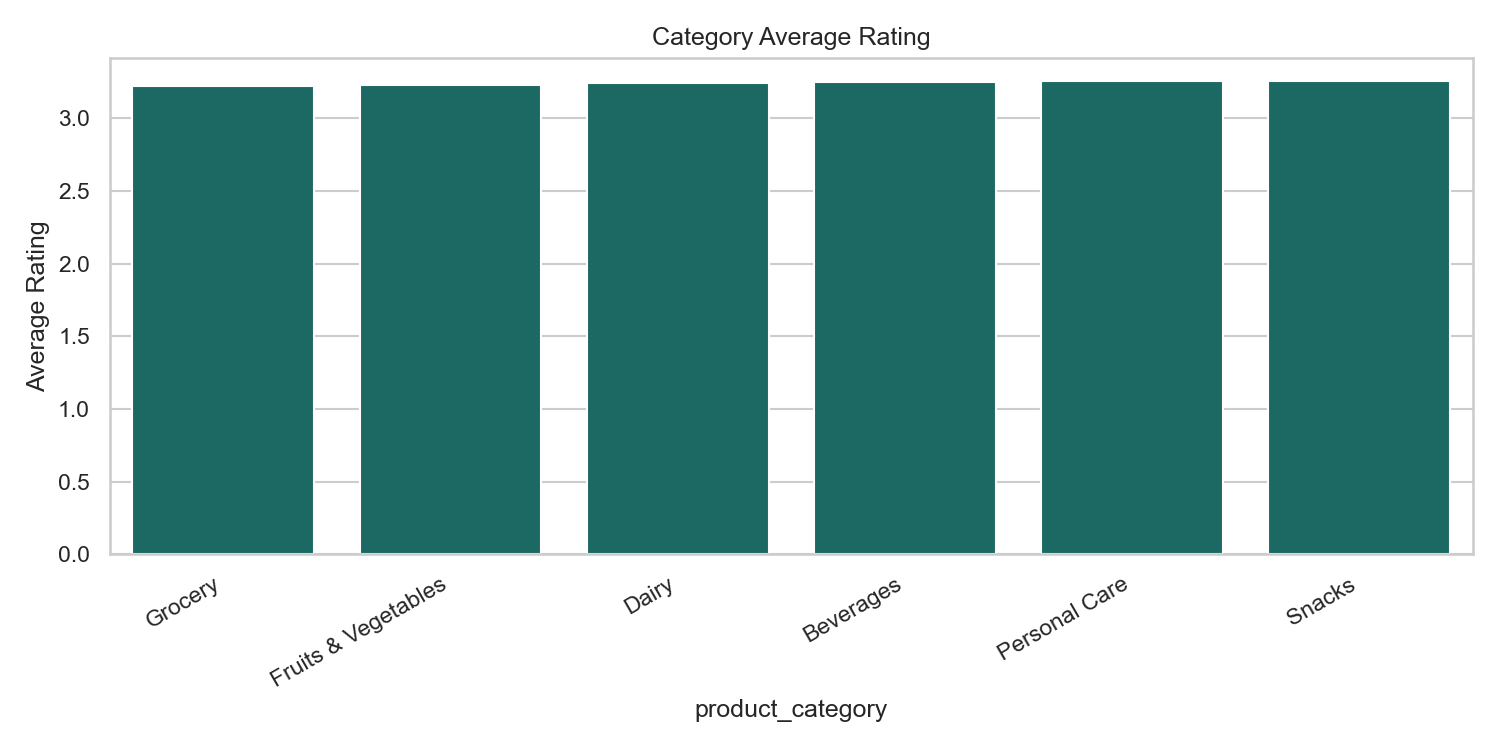
Shows which categories are rated lower and may need experience improvement.

  • Current finding: Grocery is also lowest in rating, indicating category-specific friction.
  • Business use: prioritize category-level quality audits and communication fixes.
Order Value vs Rating

Order Value vs Rating

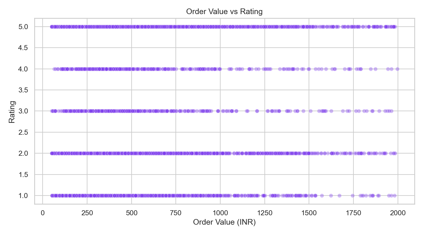
Checks if higher-value orders receive better ratings. In this case, correlation is near zero.

  • Interpretation: premium basket size does not guarantee better perceived service.
  • Business use: maintain quality consistency across all order values.
Refund Rate by Duration Band

Refund Rate by Duration Band

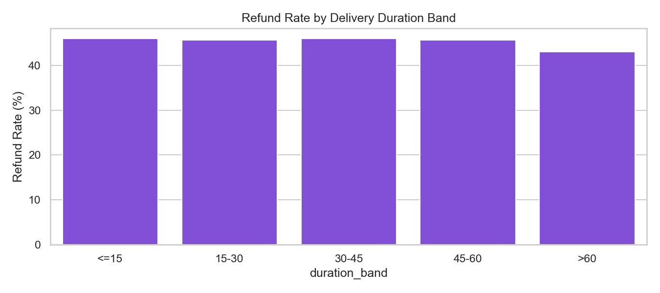
Shows how refund risk changes as delivery duration grows, useful for proactive customer recovery actions.

  • Operational use: identify duration bands where compensation has the highest retention value.
  • Business use: build refund-risk thresholds for support automation.
Average Rating by Refund Status

Average Rating by Refund Requested

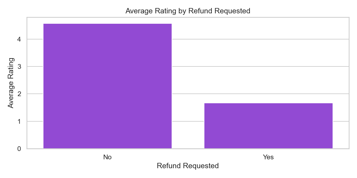
Compares average rating between refunded and non-refunded orders to measure satisfaction gap.

  • Current finding: refunded orders have substantially lower ratings than non-refunded orders.
  • Business use: trigger earlier support interventions for low-rating signals to reduce refund demand.
Order Share by Delay Category

Order Share by Delay Category

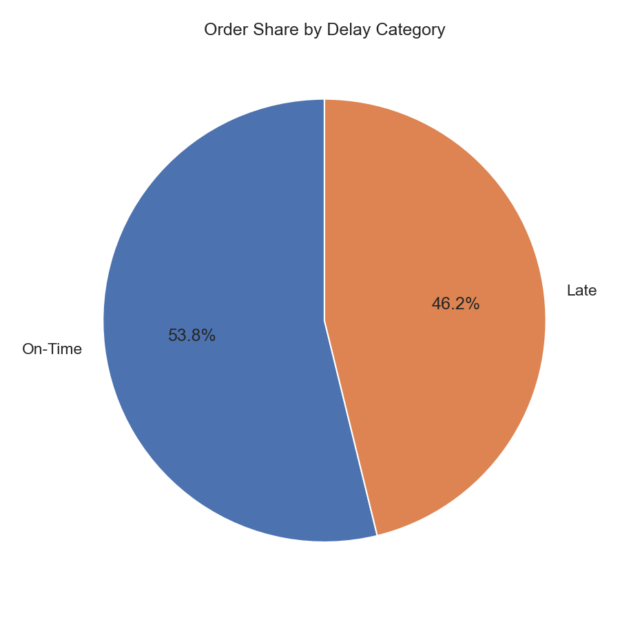
Shows the percentage split of On-Time vs Late orders for quick operational health tracking.

  • Operational use: monitor delay share trends over time and evaluate fulfillment process improvements.
  • Business use: set alert thresholds when late-share exceeds acceptable service targets.
Correlation Heatmap

Correlation Heatmap

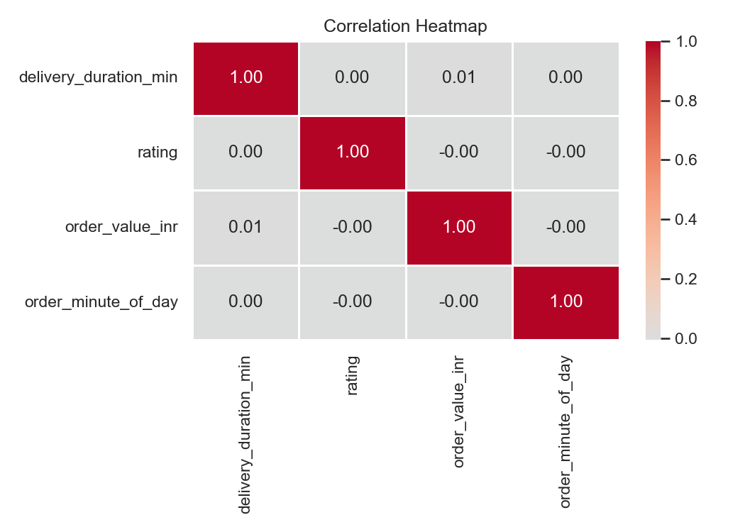
Summarizes pairwise relationships among key numerical variables used for diagnostic and model context.

  • Modeling use: select candidate features and remove redundant variables before training.
  • Interpretation: near-zero pairs suggest weak linear links and need richer feature engineering.

Power BI Dashboard Snapshot

Power BI dashboard snapshot for food delivery analytics

Interactive Power BI Dashboard

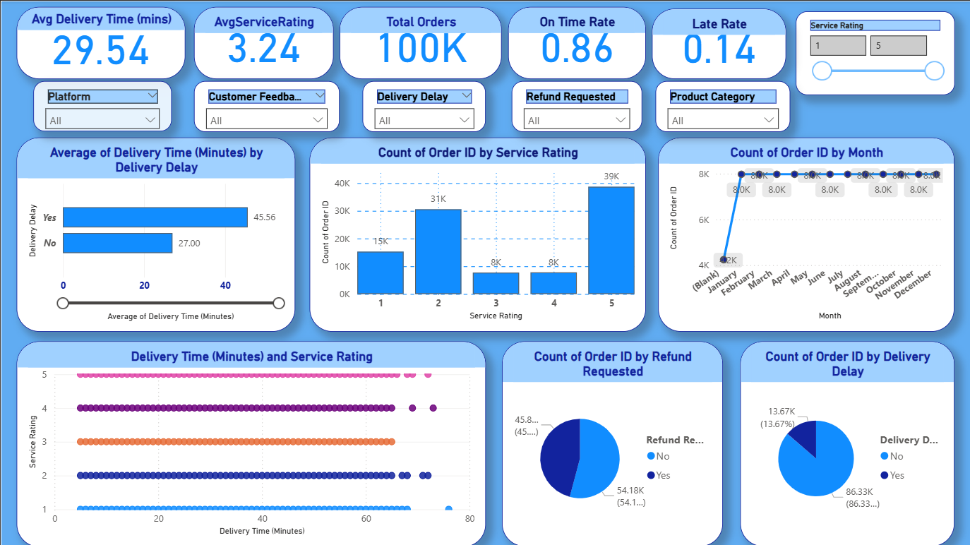
This dashboard brings the project findings together in one view. The top row shows the core KPI cards, followed by the main analytical visuals and slicers for filtering by delivery delay, platform, and service rating.

  • KPI cards summarize average delivery time, average rating, total orders, and on-time rate.
  • The bar chart compares average delivery time by delay status and shows late deliveries taking longer.
  • The column chart shows how orders are distributed across service ratings, with 5-star ratings dominating.
  • The line chart uses a generated month field because the source file does not include a real date column.
  • The scatter plot checks whether longer delivery time lowers rating; the relationship is weak in this dataset.
  • The pie charts show refund requested share and delivery delay share, which help summarize service health quickly.

Important note: the monthly trend is based on a synthetic month column created from the row index, so it is useful for presentation but not a true calendar month analysis from the source CSV.

How to Read These Results

  • Start with distribution charts to understand baseline behavior.
  • Then inspect relationship charts (scatter/box/correlation) for driver signals.
  • Finally, use category and time views to prioritize concrete operational actions.